Your website looks great. The colors pop, the layout is clean, the photos are professional. But if visitors land, look around for five seconds, and then leave without filling out a contact form or picking up the phone, you've spent a lot of money on something that doesn't work.
That's the gap between a beautiful website and a converting one. And yeah, they're not always the same thing.
Design vs. Function: Why Pretty Doesn't Pay the Bills
A lot of small business owners assume that hiring a designer to make their site "look modern" is the end of the equation. But design and function are two different problems.
Design is about aesthetics: color theory, typography, whitespace, visual hierarchy. It's important. But a beautiful site that doesn't tell visitors why they should hire you, how to get started, or what makes you different is like owning a fancy storefront with no sign on the door and no one inside to help.
Function is about answering the questions your visitor came with. Who are you? What do you do? Why should I trust you? How do I contact you?
A high-converting website does both. It looks professional, sure. But it also works like a sales tool, not a brochure.
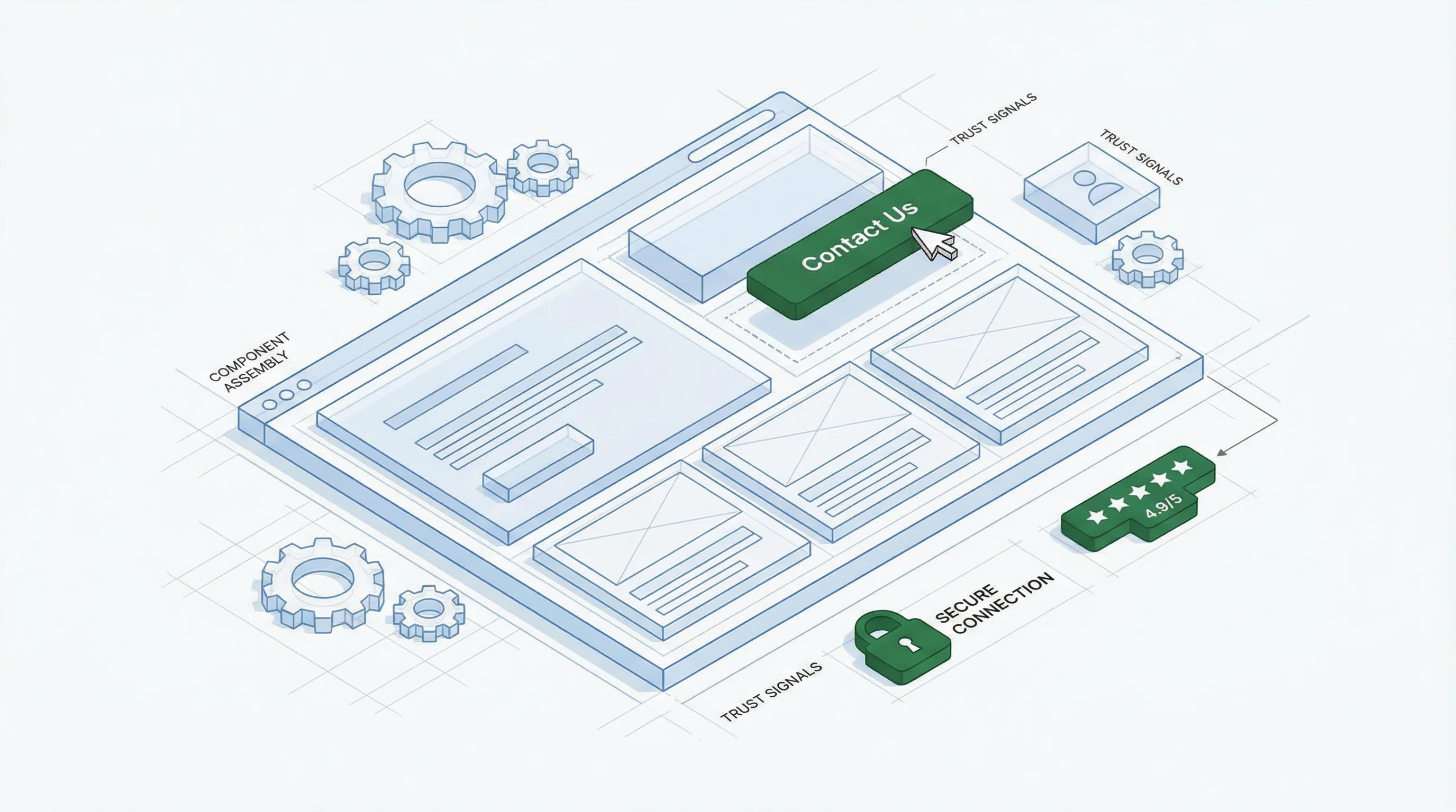
The 5 Essentials Every Small Business Website Needs
After building sites for service businesses in Phoenix, Arizona, and beyond, we've noticed that the sites that actually generate leads all share five things. Simple stuff — but most sites are missing at least one.
- A clear value proposition above the fold. When someone lands on your homepage, the first thing they see should answer: "Why should I hire you instead of your competitor?" It doesn't have to be clever. It just has to be clear. "Award-winning accounting services for small businesses in Phoenix" beats "Your financial success is our success" every time.
- One primary call to action. Too many sites scatter buttons everywhere: "Learn More," "Contact Us," "Schedule a Demo," "Call Now." A visitor shouldn't have to choose. Pick what you want them to do most (book a consultation, fill out a form, call) and make that the hero button. Other CTAs can exist, but they shouldn't compete.
- Social proof. Reviews, testimonials, client logos. Whatever proves you're legit. A stranger on the internet doesn't believe your marketing copy, but they believe other customers. Three good testimonials do more work than 500 words about how great you are.
- Fast, secure hosting. If your site takes more than three seconds to load, people leave. If it's not on HTTPS, visitors see a warning before they even read a word. Google ranks faster sites higher; your visitors trust them more. Both matter.
- Mobile-responsive design. More than half of web traffic comes from phones. If your site looks broken on mobile, you've already lost half your potential customers.
That's it. These five things are table stakes.
The Three-Second Rule
Here's a test: Show your homepage to someone who's never been to your site. Give them three seconds. Close the browser. Ask them: "What does this business do, and how would you hire them?"
If they can't answer both questions, your site has a clarity problem.
Most visitors spend three to five seconds on a homepage before deciding whether to dig deeper. If your value proposition is buried, your CTA is below the fold, or your industry isn't obvious at a glance — you're asking people to work too hard. They won't.
How We Think About This
When we work with small business owners on their websites, we don't start with "Let's make it modern." We start by asking: What is this business trying to accomplish? Who visits the site? What decision should they make while they're here?
That changes everything. Suddenly the design decisions are in service of a goal, not just in service of looking good. Your content layout, word choice, and button sizing each affect whether a visitor becomes a lead or a sale.
If your current site isn't pulling its weight, the problem might not be the design. It might be that nobody's ever tested it against these five essentials.
Your Move
Today, do this: Find someone who's never visited your website. Ask them to spend five seconds on your homepage, then close it. Ask them two questions: What does your business do, and how would they hire you?
If they stumble on the second answer, you've found your first problem to solve. Fix that before you worry about whether the color palette feels current.
If you'd like a second opinion, we offer free website audits for small businesses. We'll score your site against all five essentials and send you a plain-English report on what's working and what isn't. No pitch, no pressure. Just an honest look at where you stand.